Commercial color psychology is rapidly becoming a core strategy in modern interior design, helping businesses influence mood, behaviour and overall customer experience.
As businesses rethink their workplaces, retail stores and hospitality spaces, designers are increasingly turning to colour psychology to influence customer emotions and employee productivity. Experts say the right palette can shape focus, spending patterns and even the way people interact within a space.
The Growing Role of Colour Psychology in Commercial Spaces
Colour is no longer viewed as a decorative element—it is now treated as a behavioural tool. Interior designers report that businesses across finance, tech, retail, wellness and hospitality sectors are requesting colour-led design strategies to improve outcomes.
Understanding the Emotional Impact of Core Commercial Colours
Research shows that colours consistently trigger predictable emotional responses:
-
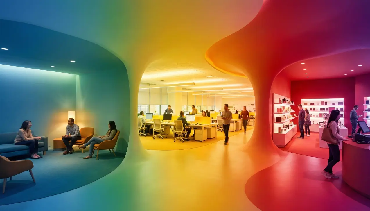
Blue — Symbolises trust and calm; widely used in finance, tech and healthcare offices.
-
Red — Drives urgency and energy; ideal for restaurant accents and retail sales displays.
-
Yellow — Conveys optimism and creativity; suited for collaborative zones and entry areas.
-
Green — Represents balance and wellbeing; popular in offices and wellness centres.
Designers stress that the effectiveness of colour depends not only on shade choice but also on placement, lighting and material finish.
Workplace Interiors: Using Colour to Improve Productivity
Businesses aiming to enhance focus and reduce stress are leaning toward cooler, muted tones.
Soft Blues and Greens for Focused Tasks
Interior professionals recommend blue- and green-based palettes for individual workstations and meeting rooms because they minimise visual fatigue and help support analytical thinking.
Warm Accents for Collaboration Zones
For brainstorming areas and break rooms, designers are introducing energetic hues like yellow and orange. These tones encourage conversation, creativity and social engagement without overwhelming the space.
Retail Environments: Colour as a Sales Driver
In retail, colour directly influences customer behaviour—from how long buyers stay to what they purchase.
Red to Create Urgency in Sales Displays
Retail strategists use red in signage and promotional zones because it quickly grabs attention and encourages faster decision-making. However, experts warn against using red as a dominant wall colour due to its intensity.
Black and Purple for Premium Positioning
Luxury brands favour deeper colours such as black and purple, which signal exclusivity, quality and high value. When paired with minimalist white or neutral backgrounds, the visual contrast sharpens product appeal.
Hospitality Spaces: Setting Mood and Enhancing Guest Experience
Restaurants and hotels are carefully curating palettes to shape guest emotions.
Warm, Earthy Tones for Dining Spaces
Restaurant designers choose terracotta, maroon and soft oranges to make dining areas feel inviting and comfortable. These hues are known to enhance appetite and encourage longer stays—ideal for full-service dining.
Cool Neutrals for Hotels and Spas
In hospitality wellness environments, muted blues, greys and natural wood shades dominate. These colours help create an atmosphere of calm and rest, forming a visual escape for travelers and spa-goers.
As companies across sectors focus on improving the customer journey and employee wellbeing, colour psychology is poised to become an essential component of commercial design strategy. Industry experts predict stronger demand for data-backed palette planning, AI-assisted visualisation, and hyper-personalised colour solutions tailored to brand identity and user behaviour.
FAQ: Colour Psychology in Commercial Interior Design
1. Why is colour psychology important in commercial spaces?
Colour influences mood, behaviour and perception. In business settings, strategic colours can increase productivity, encourage purchases and elevate customer satisfaction.
2. Which colours are best for office productivity?
Soft blues and greens are ideal because they promote focus, reduce stress and support long-term concentration.
3. How does colour influence retail shopping behaviour?
Warm and intense colours like red attract attention and create urgency, while blacks and purples elevate the perceived value of premium items.
4. What colours work best in restaurants and hospitality?
Warm tones such as terracotta, maroon and orange enhance comfort and appetite. In hotels and spas, cool neutrals and muted blues promote relaxation.
5. Can the wrong colour choice harm business performance?
Yes. Overuse of bright or highly stimulating colours can cause stress, distraction or discomfort, negatively affecting employee productivity or customer decision-making.
 , All Rights Reserved